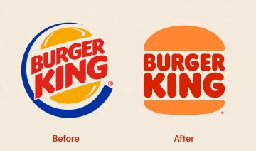
In September of 2020 the face of Burger was changed after 20 years. This was not the only change the entire restaurant was redesigned due to the era of coronavirus.
Burger King has finally decided to get rid of the blue curve that’s been in use since 1999. Burger King said the new logo meets the brand new evolution of times.
The new logo has bold new colors according to customers. The logo is also using a new font called “Flame” that Burger King made themselves to better represent their food because its bold, rounded and yummy.

The new look has also can be seen in the employees and in the food packaging. The employee outfits will display the new logo and real employees will be used in the advertisements. The food packaging will have playful words on the packaging like “crispy” and tasty”.
Burger King is introducing redesigning the restaurant itself. It will include a triple drive thru, burger pickup lockers and takeout counters. This renovation will take some time due to the fact that Burger King has 19,000 restaurants worldwide.
The new logo will instantly be recognized anywhere. Burger King hopes that all the friendly redesigns will help their sales that have dropped during the start of the pandemic. They have also released a 1$ menu in hopes that all this new revision will boost sales.
An AISG student opinion about the new logo was, “It looks more modern and makes the food items look more appealing.” So, the new logo does have the effects that they wanted to convey.
One thought on “A Makeover for Burger King”
Sorry, comments are closed.